The Multivariate Gaussian Distributed Data Visualization
Posted: Fri Mar 30, 2018 8:47 pm
The multivariate normal, multinormal or multivariate Gaussian distribution is a generalization of the one-dimensional normal distribution to higher dimensions. Such a distribution is specified by its mean and covariance matrix. These parameters are analogous to the mean (average or “center”) and variance (standard deviation, or “width,” squared) of the one-dimensional normal/Gaussian distribution.
The mean is a coordinate in N-dimensional space, which represents the location where samples are most likely to be generated. This is analogous to the peak of the bell curve for the one-dimensional or univariate normal distribution, see visualizing-random-samples-from-a-norma ... ution-5017
Covariance indicates the level to which two variables vary together (covary). From the multivariate normal distribution, we draw N-dimensional samples, \(X = [x_1, x_2, \dots, x_N]\). The covariance matrix element \(C_{ij}\) is the covariance of \(x_i\) and \(x_j\). The element \(C_{ii}\) is the variance of \(x_i\) (i.e. its “spread”).
Instead of specifying the full covariance matrix, popular approximations include:
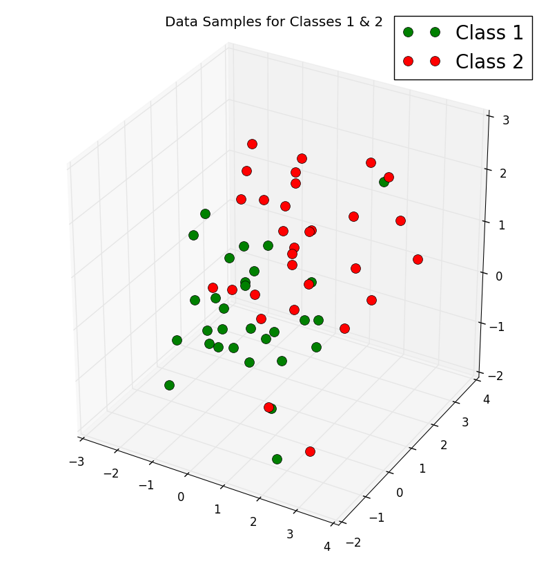
The problem of multi-dimensional data is its visualization, it would be extremely difficult to get an insight from the large sample of data and analyse it without at least visualizing it. To illustrate how we can deal and visualize the problem of multidimensional data, we will generate two \(3 \times 30\)-dimensional samples randomly drawn from a multivariate Gaussian distribution. We will assume that the samples come from two different classes, where one half (i.e., 30) samples of our dataset are labelled, Class 1 and the other half, Class 2.
We will create two \(3 \times 30\) datasets - one dataset for each sample, where each column can be viewed as a \(3 \times 1\) vector,
\begin{align}x = \begin{bmatrix}
x_{1} \\
x_{2} \\
x_{3}
\end{bmatrix}\end{align}
so that our dataset will have the form
\begin{align}X = \begin{bmatrix}
x1_{1} & x1_{2} & x1_{3} & \dots & x1_{30} \\
x2_{1} & x2_{2} & x2_{3} & \dots & x2_{30} \\
x3_{1} & x3_{2} & x3_{3} & \dots & x3_{30}
\end{bmatrix}.\end{align}
We will assume that the sample means for our two datasets (Class 1 and Class 2) are given by
\begin{align}\mu_{1} = \begin{bmatrix}
0 \\
0 \\
0
\end{bmatrix}, \\ \end{align}
\begin{align} \mu_{2} = \begin{bmatrix}
1 \\
1 \\
1
\end{bmatrix}\end{align}
and the covariance matrices are
\begin{align}\Sigma_{1} = \Sigma_{2} = \begin{bmatrix}
1 & 0 & 0\\
0 & 1 & 0\\
0 & 0 & 1
\end{bmatrix}. \end{align}
Now, let's use the code below to create two \( 3 \times 30\) datasets for Class 1 and Class 2:
We can then get a rough idea on how the samples of our two classes distributed by plotting and visualizing them in a 3D scatter plot using the code below:
The output is the attached 3-D scatter plot:
Have a Nice Easter!
The mean is a coordinate in N-dimensional space, which represents the location where samples are most likely to be generated. This is analogous to the peak of the bell curve for the one-dimensional or univariate normal distribution, see visualizing-random-samples-from-a-norma ... ution-5017
Covariance indicates the level to which two variables vary together (covary). From the multivariate normal distribution, we draw N-dimensional samples, \(X = [x_1, x_2, \dots, x_N]\). The covariance matrix element \(C_{ij}\) is the covariance of \(x_i\) and \(x_j\). The element \(C_{ii}\) is the variance of \(x_i\) (i.e. its “spread”).
Instead of specifying the full covariance matrix, popular approximations include:
- Spherical covariance (covariance is a multiple of the identity matrix)
- Diagonal covariance (covariance has non-negative elements, and only on the diagonal)
The problem of multi-dimensional data is its visualization, it would be extremely difficult to get an insight from the large sample of data and analyse it without at least visualizing it. To illustrate how we can deal and visualize the problem of multidimensional data, we will generate two \(3 \times 30\)-dimensional samples randomly drawn from a multivariate Gaussian distribution. We will assume that the samples come from two different classes, where one half (i.e., 30) samples of our dataset are labelled, Class 1 and the other half, Class 2.
We will create two \(3 \times 30\) datasets - one dataset for each sample, where each column can be viewed as a \(3 \times 1\) vector,
\begin{align}x = \begin{bmatrix}
x_{1} \\
x_{2} \\
x_{3}
\end{bmatrix}\end{align}
so that our dataset will have the form
\begin{align}X = \begin{bmatrix}
x1_{1} & x1_{2} & x1_{3} & \dots & x1_{30} \\
x2_{1} & x2_{2} & x2_{3} & \dots & x2_{30} \\
x3_{1} & x3_{2} & x3_{3} & \dots & x3_{30}
\end{bmatrix}.\end{align}
We will assume that the sample means for our two datasets (Class 1 and Class 2) are given by
\begin{align}\mu_{1} = \begin{bmatrix}
0 \\
0 \\
0
\end{bmatrix}, \\ \end{align}
\begin{align} \mu_{2} = \begin{bmatrix}
1 \\
1 \\
1
\end{bmatrix}\end{align}
and the covariance matrices are
\begin{align}\Sigma_{1} = \Sigma_{2} = \begin{bmatrix}
1 & 0 & 0\\
0 & 1 & 0\\
0 & 0 & 1
\end{bmatrix}. \end{align}
Now, let's use the code below to create two \( 3 \times 30\) datasets for Class 1 and Class 2:
- import numpy as np
- np.random.seed(4294967294) #Used the random seed for consistency
- mu_vec_1 = np.array([0,0,0])
- cov_mat_1 = np.array([[1,0,0],[0,1,0],[0,0,1]])
- class_1_sample = np.random.multivariate_normal(mu_vec_1, cov_mat_1, 30).T
- assert class_1_sample.shape == (3,30), "The matrix dimensions is not 3x30"
- mu_vec_2 = np.array([1,1,1])
- cov_mat_2 = np.array([[1,0,0],[0,1,0],[0,0,1]])
- class_2_sample = np.random.multivariate_normal(mu_vec_2, cov_mat_2, 30).T
- assert class_2_sample.shape == (3,30), "The matrix dimensions is not 3x30"
We can then get a rough idea on how the samples of our two classes distributed by plotting and visualizing them in a 3D scatter plot using the code below:
- import matplotlib.pyplot as plt
- from mpl_toolkits.mplot3d import Axes3D
- from mpl_toolkits.mplot3d import proj3d
- fig = plt.figure(figsize=(10,10)) #Define figure size
- ax = fig.add_subplot(111, projection='3d')
- plt.rcParams['legend.fontsize'] = 20
- ax.plot(class_1_sample[0,:], class_1_sample[1,:], class_1_sample[2,:], 'o', markersize=10, color='green', alpha=1.0, label='Class 1')
- ax.plot(class_2_sample[0,:], class_2_sample[1,:], class_2_sample[2,:], 'o', markersize=10, alpha=1.0, color='red', label='Class 2')
- plt.title('Data Samples for Classes 1 & 2', y=1.04)
- ax.legend(loc='upper right')
- plt.savefig('Multivariate_distr.png', bbox_inches='tight')
- plt.show()
The output is the attached 3-D scatter plot:
Have a Nice Easter!